
Give your visitors one thing to do first
What is your website’s job?
Answering that simple question can be surprisingly hard for many people. Websites need a clear purpose if they’re going to be effective. Quite often, clients struggle to explain the main goal of their website or how they would determine its success. They value the web and the importance of a website, but they often lack a clear, focused sense of what their website needs to accomplish.
As one of my mentors once put it: “websites are not meant to be, they do.”
You can define that however you want: sell shirts, add subscribers, or persuade voters. But an effective website rarely works without a clearly defined sense of purpose.
To that end, I always advise clients to ask themselves: what is the one thing you want users to do FIRST when they come to your site? Your website might have a wealth of resources, articles, and services for customers or followers to explore, but you should know exactly what one thing you’d want them to do on your site, if they did nothing else.
Consider Dropbox’s website:
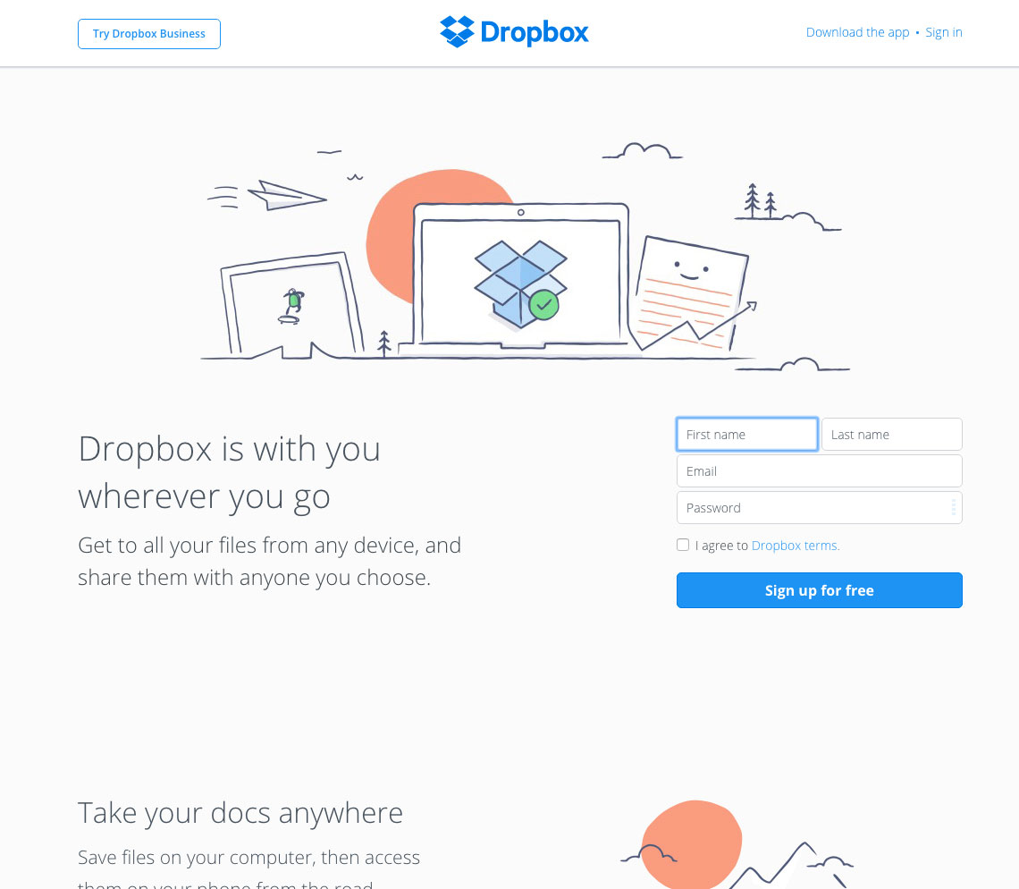
Dropbox has a wealth of content: how-to-articles, productivity tips, customer support tools, technical details about their services, and so on… but their home page is gloriously focused on one thing: getting you to sign up and try it out. They don’t bury would-be customers with information or marketing language — they focus prospects on providing their email and trying the service.
Likewise, take a look at MailChimp, which uses a similar approach.
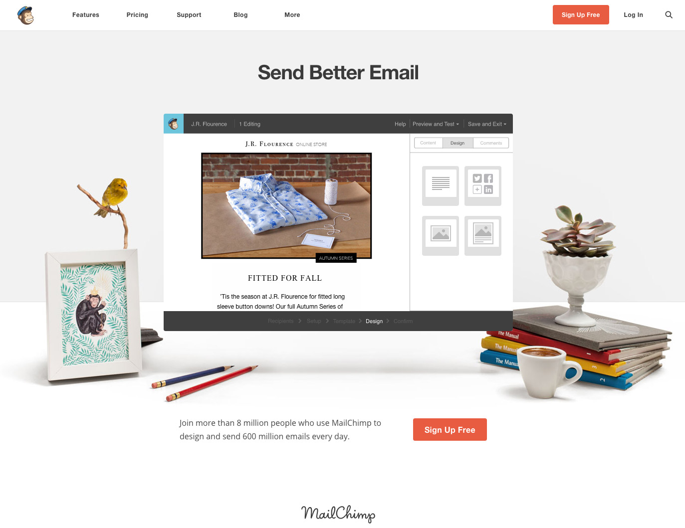
Mailchimp’s home page has big blocks of text, no heavy selling to persuade would-clients on the merits of their software. They steer users towards a huge red sign up button, wrapped up in a design element that showcases the software and a clean, seemingly peaceful work environment. You can click on “features” or “blog” to dig deeper into what they offer and how to best use their services, but the homepage has a focused design to do one thing: get people to sign up for a free trial.
Let’s look at a different type of website. Look at UNICEF, the United Nations Children’s Fund. Their mission is to save and protect “the world’s most vulnerable children, working to ensure child rights and providing health care, immunizations, nutrition, access to safe water and sanitation services, basic education, protection and emergency relief.” To do that, they rely almost entirely on the support of donors. So clearly, this is a focus of their website homepage:
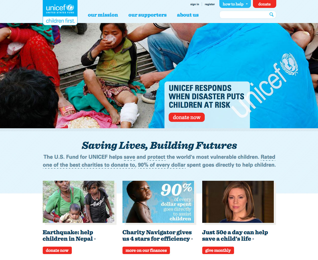
The homepage does a fine job, both visually, and with an economy of words, in explaining what UNICEF does and making a compelling case for why visitors should support it. At first glance, there’s a lot going on here, but clearly fundraising is key: there are five red buttons on the homepage, which visually jump off the page, and four of them lead users to a donation page.
Clearly, most than anything else, UNICEF is trying to nudge users to donate. Their website design seems built to make it almost impossible to miss a chance to support their work. Anything else on the site seems secondary. And that’s fine.
Websites are often big and complex and need to accomplish a lot of things. Most people want visitors to explore their site and return often. So obviously, sites need to be able to do lots of things.
But that doesn’t mean a site shouldn’t know what it wants its user to do first. Analytics show consistently that web traffic is fleeting and fickle: most users leave a website within the first minute. Try as we might, even the biggest sites can’t keep most visitors there for long.
So since you can’t hang on to visitors for long, why not make it easy for them to do the most important thing first?