
What does your website “shout across the street”?
One of the biggest influences and inspirations in my life was my high school journalism teacher, Alison Rittger, an overcaffienated editorial drill sergeant who was always armed with a red pen and a relentless prejudice against needless words. She taught me many lessons about writing, editing, and communication that I still use today.
One idea she taught was the “shout across the street” question. We used this concept when we had to come up with headlines for newspaper stories. The goal was to communicate the essence of the story in a single, clear sentence, while avoiding ambiguity and wordiness. The concept was to imagine a friend standing across a busy street from you, and you are trying to shout to them what the story was about. You can’t have a conversation, or even a long explanation. You need something, short and shoutable. Maybe 10 or 12 words at the most.
The history of journalism is rich with iconic headlines that meet this “shout across the street” test:

All of these headlines give readers the core idea of a story at a glance. You could shout any of these across the street and your friend would understand.
This lesson from Ms. Rittger sticks with me today when it comes to web and digital products. Too often, websites fail this test completely. You can stare at many sites for a minute and really not understand what it’s about, who it’s for, or what it’s trying to deliver. Often this is because of an organization or company’s mistaken belief that customers or visitors already “know” them, and so their site doesn’t need to explain. Sometimes site owners put too much faith in the patience and willingness of visitors to read long chunks of marketing text.
SO just as an effective headline should pass the “shout across the street” test, a good website should tell a visitor — within a few seconds — who you are and what you can do for them.
The good news is that this isn’t a difficult problem to fix.
Start by deciding what you want to shout across the street.
Spend time crafting a short sentence that explains your company or organization and what it’s trying to do. Like an elevator pitch, only shorter. You’ll have plenty of chances elsewhere on your website to explain in length about your brand, your mission, your products, or your people at great length. But what you need here is the simplest, most pithy summary of what you’re about. This task is never easy: no client of mine has ever been able to come up with this quickly or without lots of back and forth between writers, editors, and other stakeholders.
But before you throw up your hands and object that this is impossible, consider a few examples of sites that do this well:
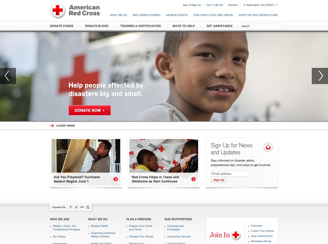
The American Red Cross passes the test. Our eye is drawn to the photo of the young boy, and next to it is a eight word summary of what they’re working to do — “Help people affected by disasters big and small” — followed by a bold, prominent donation button. This home page not only “shouts across the street,” but helps prompt users with what they want them to do first — contribute money to support their work.
Another strong example is Kiva, a nonprofit that provides micro-finance to individuals in developing countries:
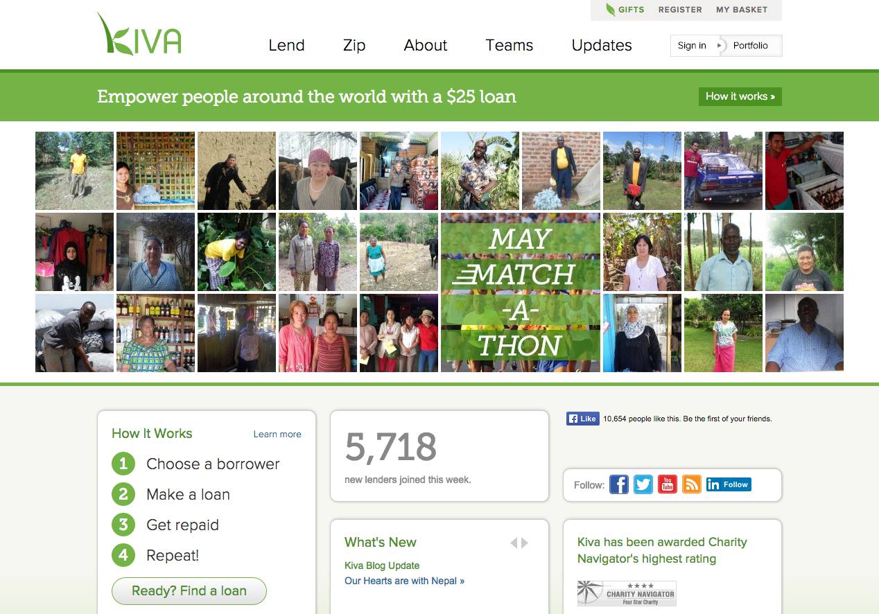
Their homepage delivers a clear, nearly-impossible-to-miss header that explains what they do — “empower people around the world with a $25 loan” — with eight-words I could shout across Pennsylvania Avenue.
How about the ACLU?
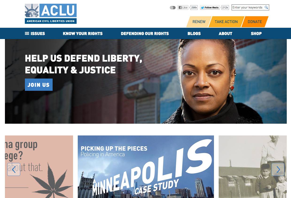
Just like Red Cross and Kiva, the ACLU uses prime visual space, strong contrast, striking photography, to explain who they are and what they do, and inviting visitors to join their fight: “Help us defend liberty, equality & justice.” Their website distills their mission down to seven words.
All three of these examples pass the “shout across the street test” — the vast majority of visitors will understand what each organization is trying to do at a glance, just a newspaper reader makes sense of a clear, well-written headline.
This approach can also work on interior website pages as well. Quite often, visitors find your content from a link to a story or blog post, and if possible, you still want to pass the “shout across the street” test there as well.
Look at how People for the Ethical Treatment of Animals (PETA) handles this problem:
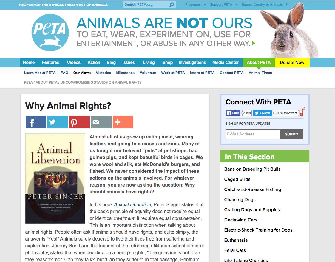
In the header on every page, next to the logo, they have a nineteen-word summary of what they stand for: “Animals are not ours to eat, wear, experiment on, use for entertainment, or abuse in any other way.” No matter how you get to a page on PETA’s site, you can quickly figure out what they’re about. And whether you agree with their take or not, you know who they are and can decide whether or not this is a site that speaks to you. If you share that sentiment, they make it easy on every page to donate money to support their efforts.
. . .
However you do it, try to get your website to pass the “shout across the street” test.
It’s not easy to come up with a pithy, concise sentence that can summarize your company or organization. But you should try. Otherwise, whatever you’re trying to say is going to get drowned out with the noise of the street.