Six things you should never do in your email marketing
While I worked for the American Red Cross, I wrote and designed hundreds of emails. Most of were sent to millions of supporters every week. I learned a lot of valuable lessons from the experience. Here are six top takeaways about what NOT to do with email marketing.
1. Expect people to read it all
I’ve written some emails with finely crafted narratives that moved some people to tears. And I wrote some emails packed with compelling statistics and facts designed to motivate supporters to action. What do they have in common? Most people never read them.
Think about how many emails you deleted from your inbox in the last 24 hours without ever opening them. When you send an email to your list, you’re lucky if a fraction of those people open it. And that’s not the worst part — most people who open your email will skim it for less than 12 seconds before moving on.
Some emails that contained my best, most compelling narrative writing got the fewest number of clicks. And many emails that were short, direct, and to the point often did the best. I learned that when you write for email marketing, you have to check your ego a bit and focus on effectiveness over craft.
If you’re counting on subscribers to luxuriate in your carefully crafted paragraphs, you’re going to be disappointed.
You get a few seconds to grab them. So don’t blow it. You don’t have time to “clear your throat” with a long paragraph setting up your real message. Don’t write long, complicated paragraphs. Use simple, short, clear sentences. Get to the point. Make it easy for people to skim the email and understand that you want.
Which gets me my second thing never to do…
2. Have no clear call to action… or too many calls to action
With only 12 seconds or less to grab most readers, make sure that within half that time, they can skim your email and know what you want them to do. Give your email a clear, focused call-to-action.
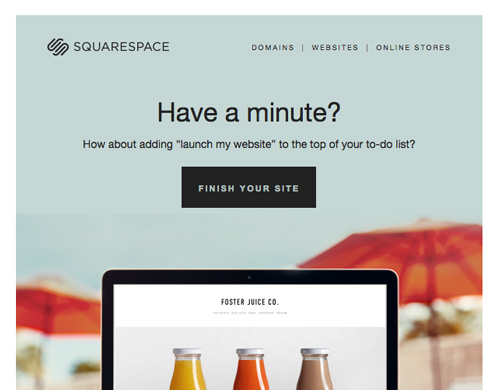
Look at this smart email from Squarespace, prodding a user to come back and complete a website project that has gone unfinished.

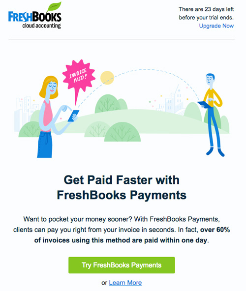
Here’s another good example from Freshbooks, which gets right to the point and tries to sell a potential customer on another one of their services. I get three sentences that explain the offer and a bright green button that asks me to try a service that suggests it will help me “get paid faster”:

Whether you’re asking people to donate money, subscribe to a service, or sign up for an event, make it obvious.
Give your email the “squint test” — if you sit back and squint at your email on the screen, can you still see where your attention is supposed to be focused? If it’s done well, you should have a clear, bold button or a big link that clearly indicates what you want from them.
Some emails suffer from the related problem of having too many calls to action — multiple buttons and links, all going to different places. The worst thing you can do is confuse your reader. It’s OK to have more than one link, but it should be clear which one is the obvious best choice. The example from Freshbooks actually has two links there, but it’s clear which one they most want me to click.
3. Put important information inside images
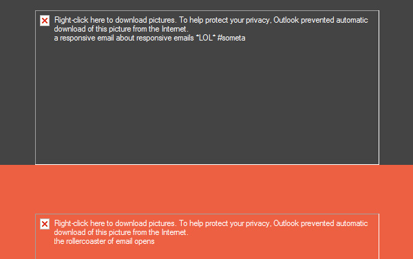
Here’s a fun fact: today, about a third of all email readers block images by default. Outlook still blocks images by default for most users, even in 2018. There are plenty of guides to overcoming this challenge, but ignore this issue at your peril. They might see something like this:
 (image from Litmus)
If you have something really important to say in an email, don’t put it in an image. A big chunk of your readers just won’t see it. You’re better off using images to support your message with visuals, not as a place to convey your actual message.
4. Design only for big screens
In early 2017, data showed that 51% of all email is opened on mobile devices. And that trend has been rising for years. If anything, we should all be designing and testing emails for small screens first, and big desktop screens second. And yet, many communications and marketing teams rarely do anything but preview and test emails on laptops and widescreen monitors on their desks.
5. Send too many emails
This one is easy: don’t make people regret signing up for your emails. When someone subscribes to your email list, there’s an implicit assumption you won’t abuse that trust and flood them with emails.
Pick your spots to engage with your audience, and make those opportunities count.
If you blast them with 3-4 emails a week, two things can happen with many of them, and neither are good: 1) they’ll unsubscribe, or 2) they’ll just ignore you and tune our all future emails. Either way, you’ve lost the ability to connect with

Personally, I’ve unsubscribed from emails from causes and organizations I strongly support — or who I’d given money to in the past — because I just couldn’t take the constant email noise.
Bottom line: don’t give flood your supporters inboxes or they’ll tune you out.
6. Write like a robot, a greeting card, or a Dentist’s office
The key to effective email marketing is authenticity — you want your audience to feel like the message is coming from a real person or team. It should seem human and conversational.
Too many marketing emails miss this, and their language is often riddled with clichés, stiff marketing speak, or transactional messages that seem generated by a computer algorithm (maybe some of those are).
Write the email as if it were going from you to ONE supporter. Think of it as a really short conversation with you asking a favor at the end. Use natural language — contractions, short sentences, and simple, direct language. Read it out loud to yourself to hear if it sounds like a human being.
Let go of the impulse to be fancy, clever, or sophisticated, and you might be surprised at how good your results will be.