Four great nonprofit emails and why they work
In 2018, email is still the most effective way to connect directly to supporters and donors. By almost every metric — open rates, clickthrough rates, return on investment — email marketing drives better results than Facebook, Twitter, Instagram, or other social media channels. Six out of ten people check their email first thing in the morning, and nine out of ten
Think about how many emails you received but didn’t open today, the ones you trashed unseen. How many did you open and skip within a couple seconds?
Your audience is no different. If you’re lucky, one in three, maybe one in four people will actually open your message, and when they do, you need it to drive people to do something: sign up, subscribe, share, or donate.
Well written and designed emails can make the difference between a campaign that is effective and one that fails.
What does that mean? Let’s take a close look at four examples of highly effective nonprofit emails:
St. Jude

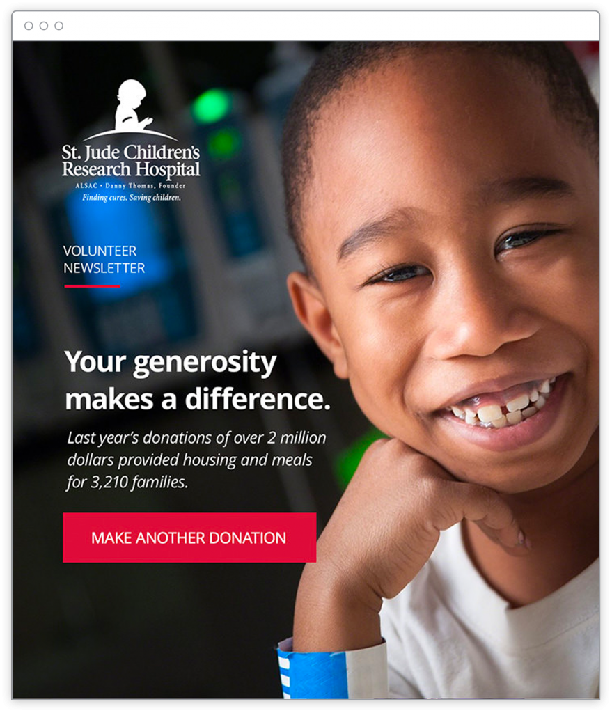
This email from St. Jude Children’s Research hospital is refreshingly simple and effective. It does a lot with one photo and fewer than 25 words. And it does something powerful and compelling. It tells a story.
First, this email is designed for past donors. So it begins by reminding the recipient that they’ve previously shown generosity and commitment to the cause of finding cures for childhood cancer.
Second, the second line in the email emphasizes results. It shows the reader that “last year’s donations” were meaningful, showing real numbers and highlighting the tangible support provided to more than 3,210 families. (I love the use of the exact number!)
Third, the whole message is designed on top of a smiling photo of a young boy. He’s looking directly at the reader. The wristband at the bottom of the photo a subtle indication that this boy is a patient, the kind of kid who might be part of one of those 3,210 families helped by past donations.
Note that the kid doesn’t look sad or in pain. Unlike some nonprofits that use sobering or shocking photos to guilt readers into giving, this photo is aspirational. It suggests that your past donation may be one reason the boy is smiling. That, in itself, is a miniature narrative: You gave. We helped families in need. And you’ve helped bring a smile to this young child’s face.
And finally, the email is anchored by a big, red, cant-miss-it button that asks the reader to “MAKE ANOTHER DONATION.”
This email is brilliant in its execution. It is short, compelling, and direct. Someone could read it in less than five seconds. This email does more with one photo and 23 words than most nonprofit emails do with hundreds of words and many more pictures. It’s a great reminder that quite often when it comes to email marketing, less is more.
Charity: Water

I’ve written and spoken about Charity: Water at length before — they have a strong handle on their design and messaging. And their emails may be their biggest strength.
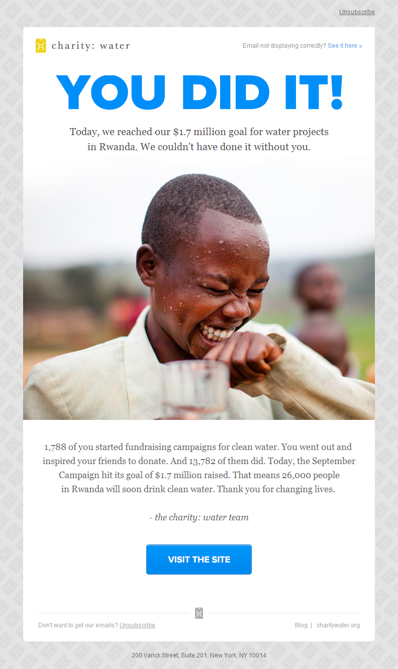
The headline booms “YOU DID IT” above the photo of the child showing a genuine sense of joy (and with a visible glass of clean water in his hand). It shares concrete numbers to explain what was raised and how many donors joined the effort, then shows specifically how many people have been helped.
Finally, it explicitly thanks the donor — “Thank you for changing lives” — not for the money, but for the meaning of what they gave. The emphasis is on results, not revenue. They keep the focus on where the donation goes and whom it helps.
I love this example because it’s not about asking for anything, it’s about thanking supporters and giving them a sense of reward and accomplishment.
Charity: Water is playing the long-game here. They know they’ll come back again in the near future and ask for donations, but this email focuses on results and gives the donor a big positive reward.
Patagonia Action Works

Clothing retailer Patagonia has a special program, Patagonia Action Works, that connects its customers with local environmental groups. This email encourages would-be volunteers to lend their unique talents to one of the many organizations it supports.
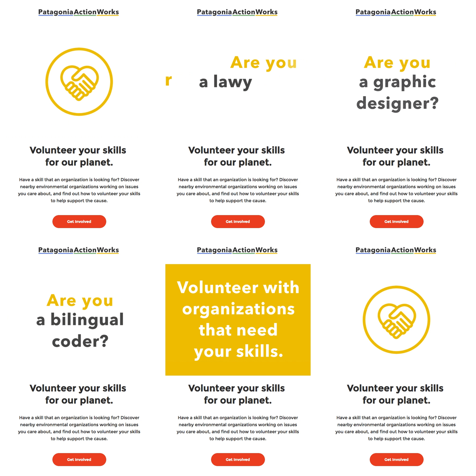
There’s a lot to like about this email. This previews only the top part of it (see the full email here), but it highlights a lot of what they do well:
First, it makes good use of animated images. Almost every email application and service now supports animated gifs (the most glaring exception would be Outlook 2007-2013). The animation asks simple questions about skills, then closes with the appeal for readers “volunteer with organizations that need your skills.” Litmus found that emails with animations tend to perform better than those without animations. The bold gold background and the smooth animation grabs the reader’s attention. The animated introduction here uses just enough text to keep readers engaged without overwhelming them, and it closes on a clear call to action.
Second, the headline uses clear, direct language. “Volunteer your skills for our planet.” They then describe what they’re asking for in two short sentences, followed by a bold red “Get Involved” button. If a reader never makes it past this initial call to action, it’s clear what this email is about and what is asking from supporters. They don’t overwhelm the reader with text. The email is clear, spare, and designed with ample amounts of white space that provides focus.
Finally, it speaks well for the Patagonia brand in general. An email like this shows that the clothing company doesn’t just sell outdoorsy stuff, it believes in the preservation of the environment and natural ecosystems. It shows a commitment to public parks and natural spaces. Whether or not someone commits to getting involved, it reinforces their brand and mission and gives them credibility as the place to go for outdoor clothing and gear. It sets them apart from Walmart or Target or Amazon. So it’s a win-win: they may help connect hundreds or thousands of supporters to local environmental groups, or if nothing else, they boost loyalty and enthusiasm for Patagonia in general.
American Red Cross

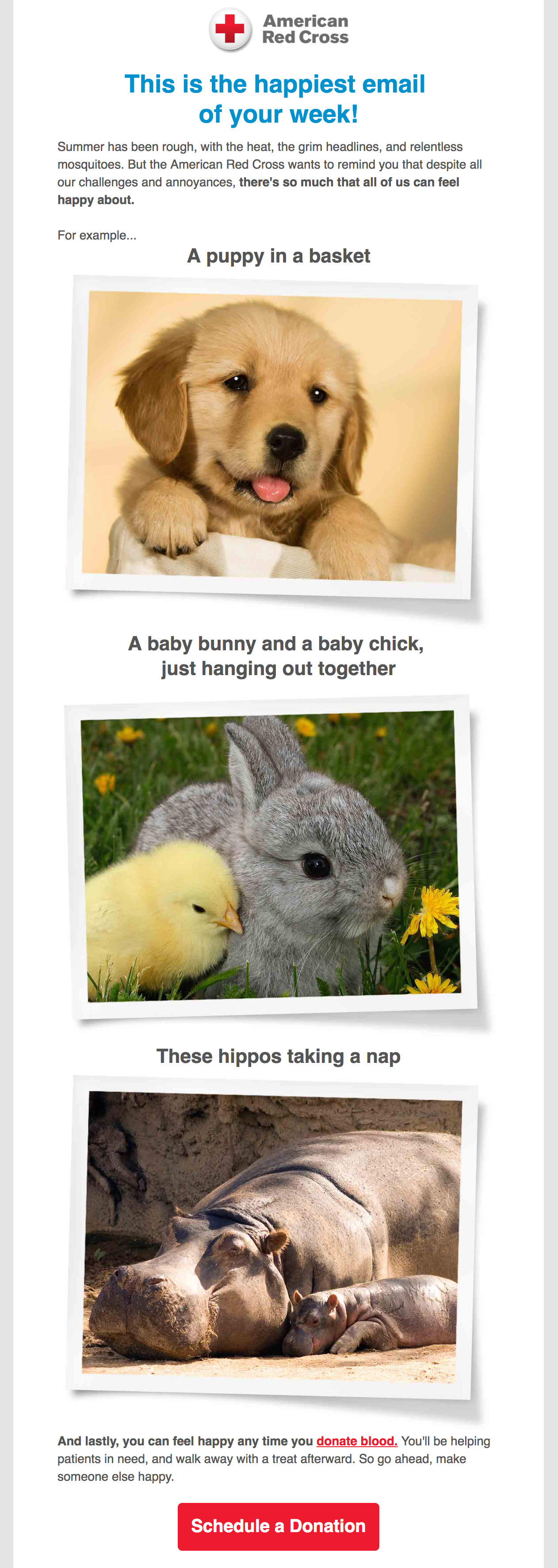
Fair disclosure: I created this one for the Red Cross in 2016 while I was their lead copywriter for emails going out to millions of blood donors. So yes, I’m showcasing my own work, but I think it’s worth sharing as a good example of breaking with expectations and conventions to get strong results.
Here’s the story: in the eight weeks prior to this one going out, donors were being sent serious emails warning of emergency blood shortages and critical needs of patients across America. And it was all true. Things were dire. But it seemed that week after week of grim, heavy, sobering emails about an urgent blood crisis had led to a point of diminishing returns. The rate of digital blood donation appointments was slowly dropping.
So that’s where this email came in. It was written and designed to be lighthearted, goofy, and a deliberate change of tone from the long series of dead serious emails that preceded it. My goal was to shake up the donors and surprise them. We wanted to jolt them out of their inactivity.
And it worked. This email went out on a Monday and was one of the highest performing emails of the year, both in open rate and engagements. The sudden shift in tone, style, and message helped spark a boost in blood donation appointments.
Lessons learned:
— Sometimes you need to shake things up to reach your audience.
— Don’t be afraid to take creative chances to wake up supporters.
— Mixing occasional lightness and humor into nonprofit messaging can bring great results